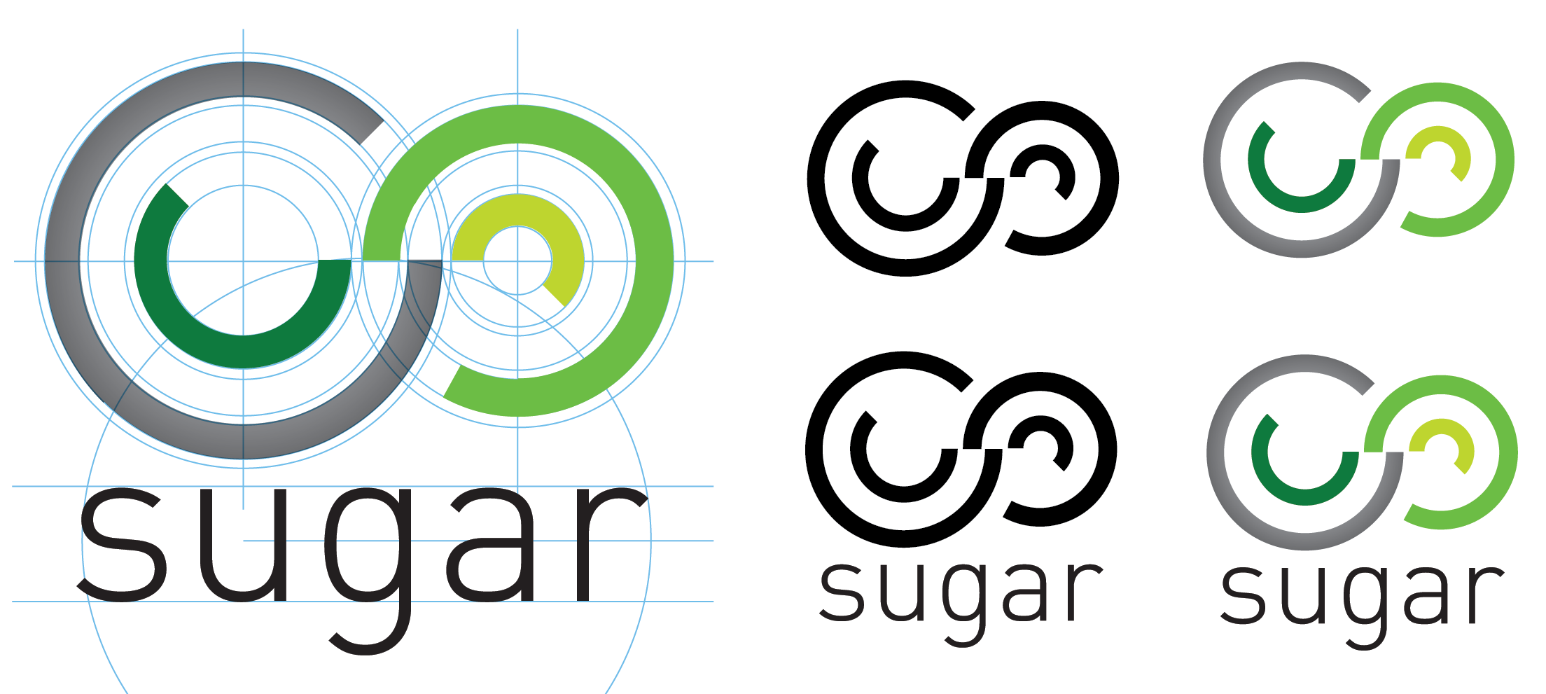
The education industry is a lucrative and competitive environment. Only the best work with the best and in the case of the SUGAR network (Stanford University Global Alliance for Re-design) the group required a collective identity reflecting interdisciplinary innovation, real world application and integrity to the problem.
The network is a collaboration of approximately 20 universities and includes disciplines from business, engineering and design. A core element of the network is a focus on the iterative design process. (Define the problem > Needfinding and benchmarking > Brainstorming > Protoyping > Testing with users > reDefine...)
As the designer I collaborated with a small team that in turn collaborated with a wider network across cultures and countries to develop a new brand and website.
The process of logo development with the global stakeholders included an online survey software to refine the design process and gather feedback towards a final branded solution.
Some of the key feedback involved the following words; innovation, education, collaboration, network, energy, globally, a symbol of the iterative process, following ideas in parallel, having a new start, in an other direction, evolving parallel lines symbolize parallel working teams, different countries or continents.
The final logo represents an evolution of the initial strong iterations. The essence of an infinity symbol visualizes multiple paths irrespective of disciplines, they work together, on large and small projects, the multiple paths will always lead to new insights, innovation and simple strong modern commercial outcomes.
The SUGAR network brand demonstrates the reach and quality of the global university network partners.
Sugar Network http://www.sugar-network.org


